
For this week’s blog post, I have selected one of my previously created PowerPoint presentations and as now I have better knowledge of how to create a presentation by following the design principles of multimedia learning, therefore, I redesign and tweak few slides to implement the multimedia learning theory as below:
- Cognitive load theory
- Redundancy principle
- Multimedia and modality principles
- Signalling principle
- Signalling and coherence principle
Presentation slides
This presentation was created to deliver a professional development session for my department in the vocational college. The topic was different types of grading within a vocational context. I still feel that I can omit some of the text from my presentation but as it is a professional development session and I have planned some activities for the teachers so there is a limit to remove text from each slide. Although I used visuals and graphics to make each slide appealing to the audience. Each slide is a guide to me on what I need to present in front of my audience as I never read my slides. Moreover, I provided some handouts for the activities.
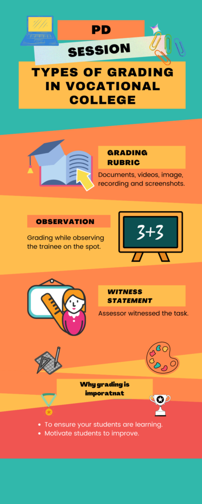
Apart from that, I have redesigned the infographic using Canva. Infographic is a graphical representation of the data to make it meaningful information and easy to understand. My infographic consists of images, patterns, colourful themes, and limited text that will give an overview of the topic to the instructor who join my professional development session. It’s a well-structured, visually appealing, and short infographic that demonstrates clearly what are the objectives and what to expect to learn after attending the professional development session.
References:
Crozier, N. (2021, October 4). Week 5: Design principles for multimedia presentations. EDCI 337 Interactive and Multimedia Learning. Retrieved October 10, 2021, from https://edtechuvic.ca/edci337/2021/10/04/week-5-design-principles-for-multimedia-presentations/.
2021-10-10 at 2:56 pm
Hey Anum,
Great post, I really enjoyed going through your presentation after you’ve revised it and made some tweaks- looks great! It would be very interesting to compare how it looked prior to making the changes. Your slides were very visually appealing and easy to follow. Your infographic also looks great. It tells a good story and is easy to understand. You also used colors and images well to make the infographic better. I’ve used Canva before as well, it’s a great place to create infographics. However, I would highly recommend trying out Visme. You can create both PowerPoints and infographics, with plenty more options.
Again, Great post! Looking forward to your future posts.
-Musab
2021-10-18 at 3:00 pm
Hi Musab,
Thank you for the feedback.
That’s sounds amazing I will try Visme.
Thanks,
Anum
2021-10-10 at 7:53 pm
Another great post, Anum!
I think it’s really neat that you included a PowerPoint and infographic you’ve made! They are both very well done. I would have to agree with you that the PowerPoint is potentially a little wordy, but it is still way better than most of the slide presentations my professors have created!
I really like your infographic too! It is very clear to understand and I love the colours that you chose and used throughout.
I look forward to your next post,
Tyanna 🙂
2021-10-18 at 3:03 pm
Hi Tyanna,
Thanks for the feedback.
Yes, sometimes we need to add all the related content specially when it’s a training session.
Thanks,
Anum
2021-10-10 at 10:54 pm
Hi Anum,
I like your idea of taking the infographic as a preview of your presentation which gives the audience a clear overview of your content and makes it easy to follow and understand. Also, the pleasing colors you used highlight the headings while matching each other so well.
Looking forward to your next post!
Qing
2021-10-18 at 3:05 pm
Hi Qing,
Thanks for the positive feedback.
I try my best to design presentation based on the lesson we covered.
Thanks,
Anum
2021-10-12 at 5:39 pm
Hey
I liked how you used the infograph as a preview before you showed us the powerpoint slide, a very creative detail. With not so much details it would not overwhelm the readers, then showing us the slides was a great addition after the infograph. Personally I would say use a different colour scheme as those colours are quiet bold in the infograph, but personal choice.
saelex
2021-10-18 at 3:09 pm
Hi Salex,
Thanks for the valuable feedback and recommendation.
Yes, personally I use earthy tone, but my instructors (team) always asked me to use bright colors in the documentation therefore I decided this theme to make it catchy immediately.
Thanks,
Anum
2021-10-12 at 7:37 pm
Hi Anum,
I love your infographics that you (re)created! Although it is a different format, powerpoint and infographics, the difference in the overall impression of the two is day and night! I still think your powerpoint is neat, easy to follow, and clear, but your infographics are more on point. Thank you for sharing your work, Anum!
– Anna
2021-10-18 at 3:11 pm
Hi Anna,
Thanks for the feedback and reviewing my presentation and infographic.
Thanks,
Anum
2021-11-20 at 7:08 pm
Hi Anum!
I really love the style of your infographic! And your PowerPoint is really straight to the point and easy to follow. I do like your idea that you used the infographic as a preview before you showed the PowerPoint slide! Thank you for sharing these.
Yinghao
2021-11-27 at 9:32 am
Hi,
Thanks for taking the time and read my blog. Your positive feedback is highly appreciated.
Thanks,
Anum
2021-12-01 at 8:52 pm
Hi Anum,
Thank you for sharing your infographic work and PowerPoint work, I really like the way you use them to explain the theories from a practical perspective, your infographic is nice and really easy to get the point you want us to know, great blog!
Jun Yang